Music Channel Part 3 - Branding
This is the third in a series of posts about analyzing YouTube music channels.
- Part 1 - Music Channel Introduction and Data Collection
- Part 2 - Analysis of Channel Activity
- Part 3 - Branding
Branding
Remember that we’re basing our channel the behavioral patterns of some other channels:
Among their other patterns, we’re going use them as a base for how to brand our channel as well.
Branding in this sense is going to include:
- Channel Name
- Main graphics, including:
- icon
- font choices
- style, like whether it is just text or includes some form of art
- Video Style, including:
- text layover
- background choice
- animations if applicable
- Additional graphics, like channel banners
The types of music we’re going to upload, as well as what we’ll put in each video description, is a concern for later.
With that said, let do some research.
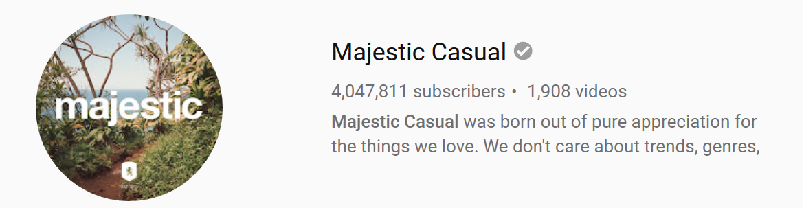
Majestic Casual
Name
The name doesn’t conjure up any image in specific, but does have an elevating, relaxed feeling to it. It is majestic, and it is casual. I find the pronunciation of the back-to-back ‘c’ sounds to be a little difficult.
Main Graphics
crest
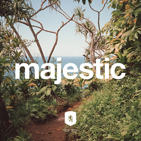
stamp
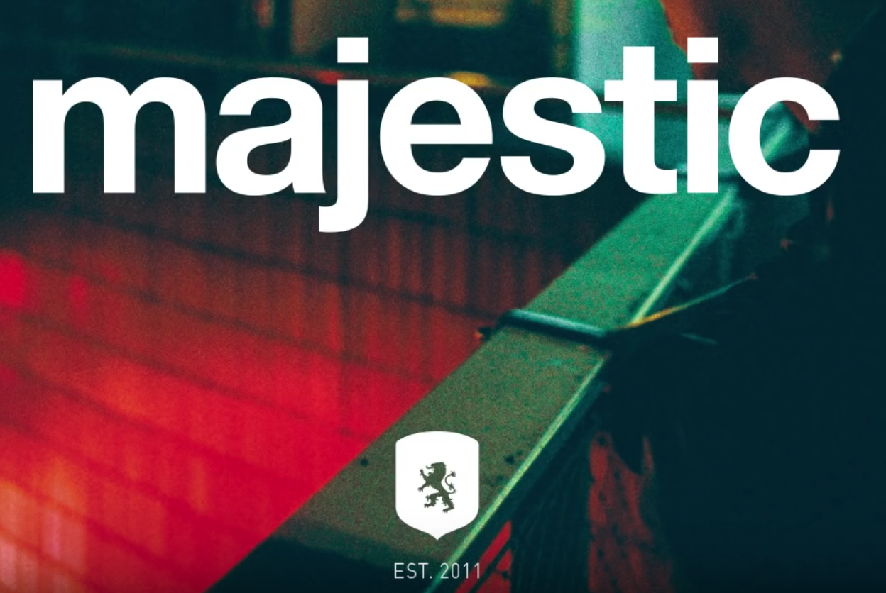
banner

search
Video Style
One of the things we notice is that there are really two different logos. There’s the main one, found on the channel icon and stamped on each video, and the stylized formal one in the banner. I’ve chosen to call this duology, which is common, the House Crest / Stamp duology. The House Crest contains the short form of the channel name, and may also contain some other designs. The Stamp tends to contain the full name.
To throw things off immediately however, Majestic Casual reverses the use of their crest and stamps - they use their crest for everything, and they only use their stamp for the channel banner.
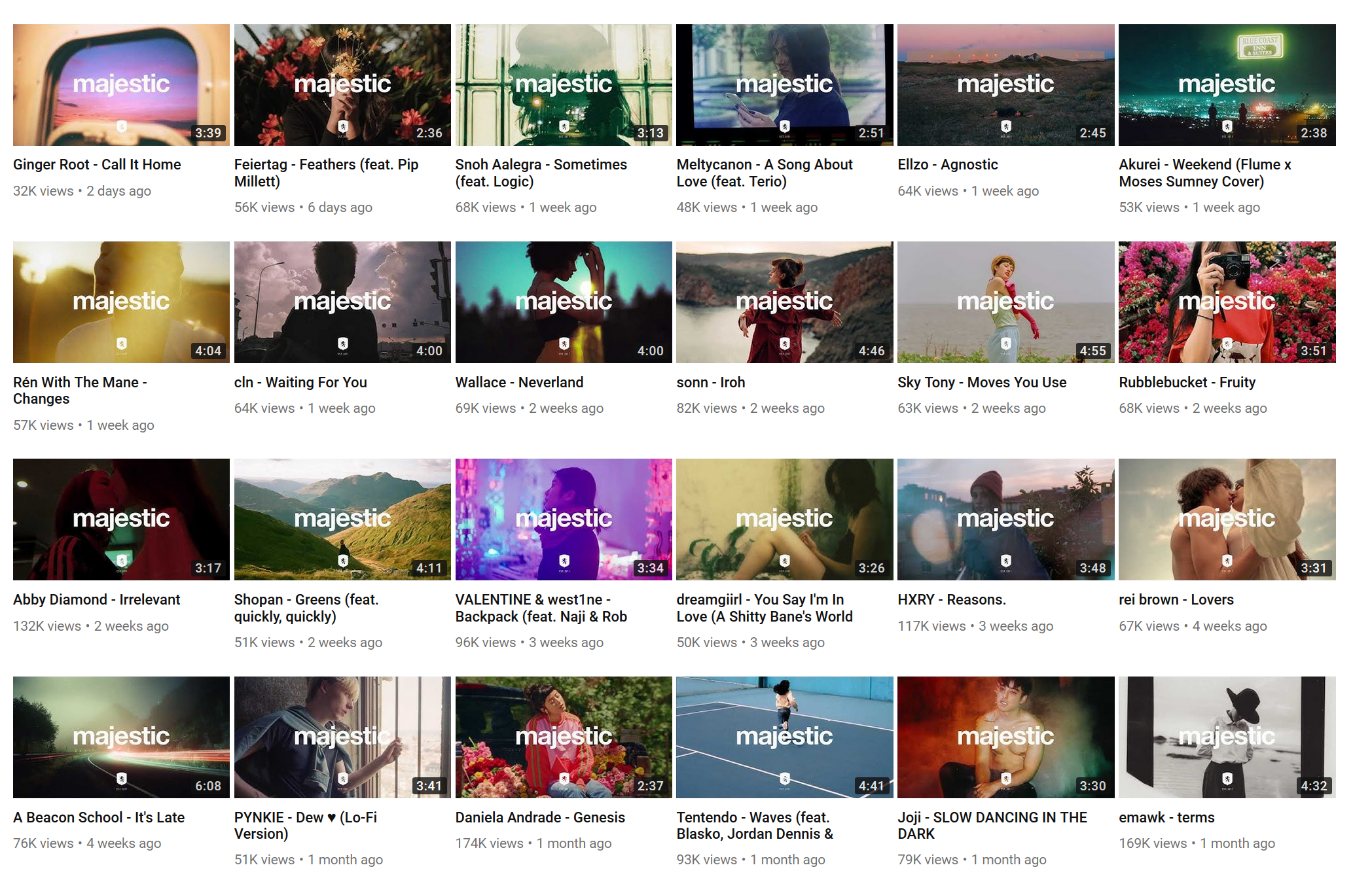
Majestic Casual does not include any song or artist information in their thumbnails, they only show their own name.
Majestic Casual also follows a relatively common pattern among some music channels of making their crest just simple text with simple font. The rest of this list won’t include any more examples of that, but it is common, presumably among people running channels who do not have any design chops.
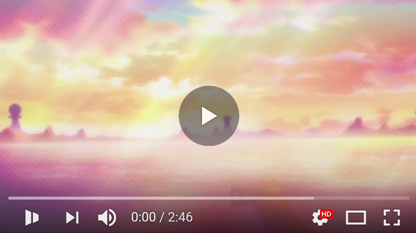
Video 1
https://www.youtube.com/watch?v=z1iHqt0-zs0
Majestic Casual doesn’t do animations, and their video graphics are on a what-you-see-is-what-you-get basis with respect to the video thumbnails.
Case in point:
Thumbnail: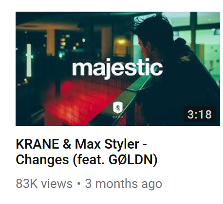
Video:
Majestic Casual’s video graphics break down into showcasing either a
A) handsome man
B) hot girl, or
C) shot of nature, featuring either A or B or neither.
We see here demonstrated Type A.
Video 2
https://www.youtube.com/watch?v=glK5DW9070w
Static shot, mostly of nature but there’s a cute girl in the middle too.
Video 3
https://www.youtube.com/watch?v=R3zj_c272YM
Static shot of hot girl.
Style Summary
Majestic Casual is the easiest of all graphic types to mimic. Easy crest, easy stamp, and the only work they put into their video graphics are changing up the background image. For the lazy among is, this is the way to go.
As far video graphics go too, they’re an easy style to consider. Grab some images of scenery or attractive girls from the internet and go to town. Majestic is a channel of minimal effort.
The main problem with them is one of recognizability. At a glance, Majestic looks generic, although it is likely that everyone else copied them, given how early they were to the scene.
Video Graphic Information
Majestic Casual includes their branding in each frame of the graphic.
They do not include song information.
They do not include artist information.
They do not include genre information.
Additional Graphics
Included in the Majestic stamp is this lion emblem, which contains the year they were established.
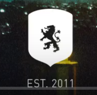
I’m not sure how important this is to their branding, it kind of fades into the background in every video. If they dropped it completely from their branding I don’t think they’d suffer in any capacity.
About
From their About page:
Majestic Casual was born out of pure appreciation for the things we love.

We don’t care about trends, genres, stats or names. We value authenticity and diversity, things that spark our memories and emotions. To find these rare experiences we stay curious and always with open ears and eyes for the undiscovered.

Majestic Casual is a carefully selected collection of things we admire. Our very favorite discoveries shared with curious minds from around the world – the list of recommendations we’d give to our friends who seek for some good advice beside the commercial and algorithm driven mainstream.
Additional notes
Majestic has gone all out on the other social media site game. An active twitter (last post October 16), an active SoundCloud (last repost October 15), an active Facebook (last post October 13), an active Instagram (last post October 17), an actively maintained Spotify playlist (last updated October 15), and Snapchat.
What these guys don’t have is a real website, although they do have a store, and the main domain redirects to their YouTube channel.
Website
Although they own the majesticcasual.com domain, it’s just a redirect to their youtube channel.
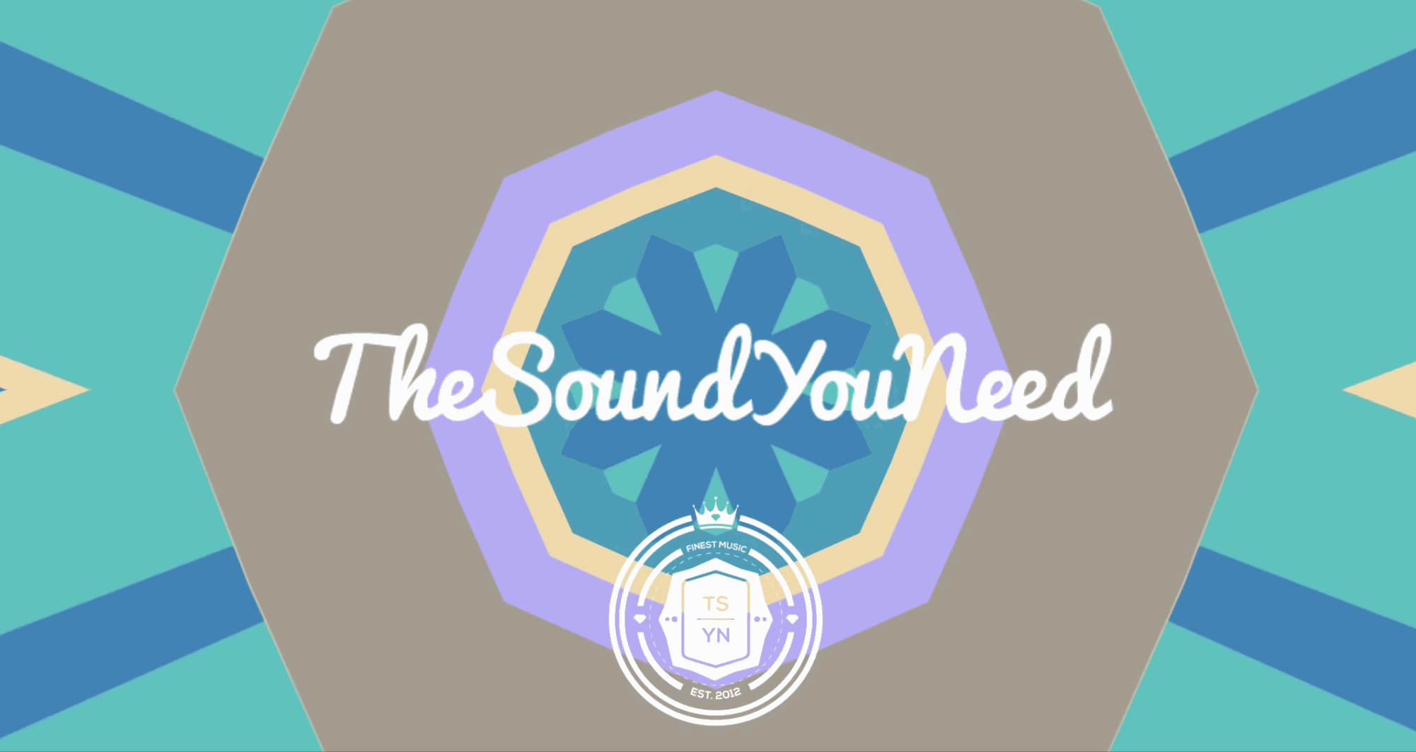
TheSoundYouNeed
Name
A bold but smooth choice of name. They got what you need, and it’s some good sound. Stylistically they chose to run their name together, which makes it easy to search for and gives it that “you know it when you see it” quality.
Main Graphics
crest
stamp
banner
search
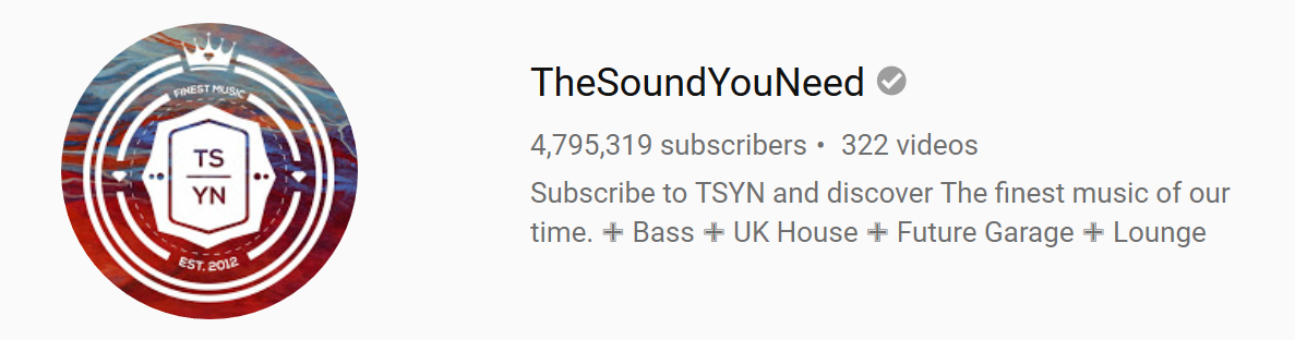
Video Style
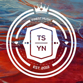
We see another example of the Crest / Stamp duology.
Their crest is a nicely designed symbol that contains their shortened channel name TSYN, for The Sound You Need, along with when they were created (2012, apparently).
Their crest is also the perfect size to be used as a user-icon, which in recent trends is a circular crop of a rectangular image.
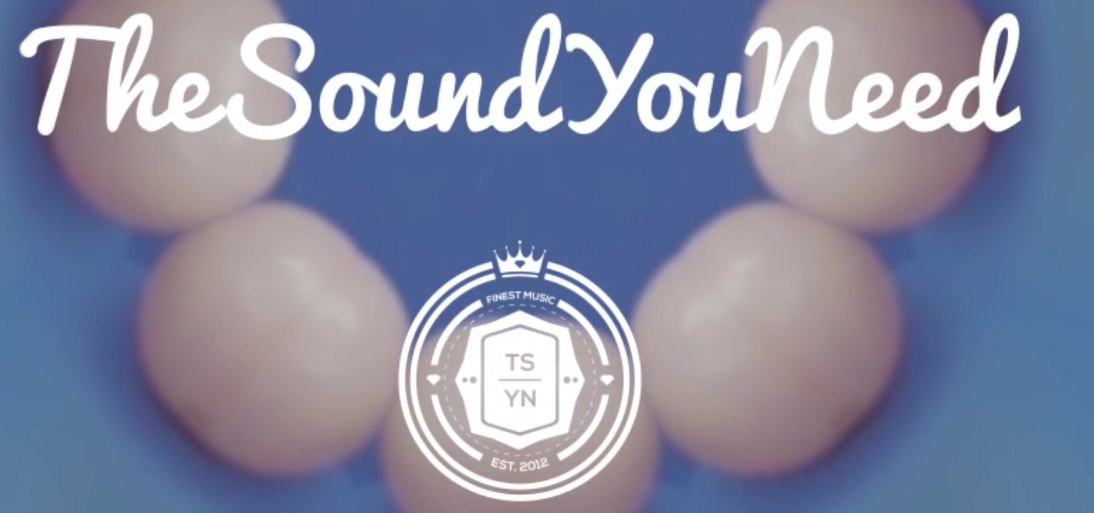
Their stamp, a somewhat loopy looking font writing out their full name without spaces, TheSoundYouNeed also contains their crest beneath it in a smaller font.
TheSoundYouNeed does not include any artist or song information in their thumbnails.
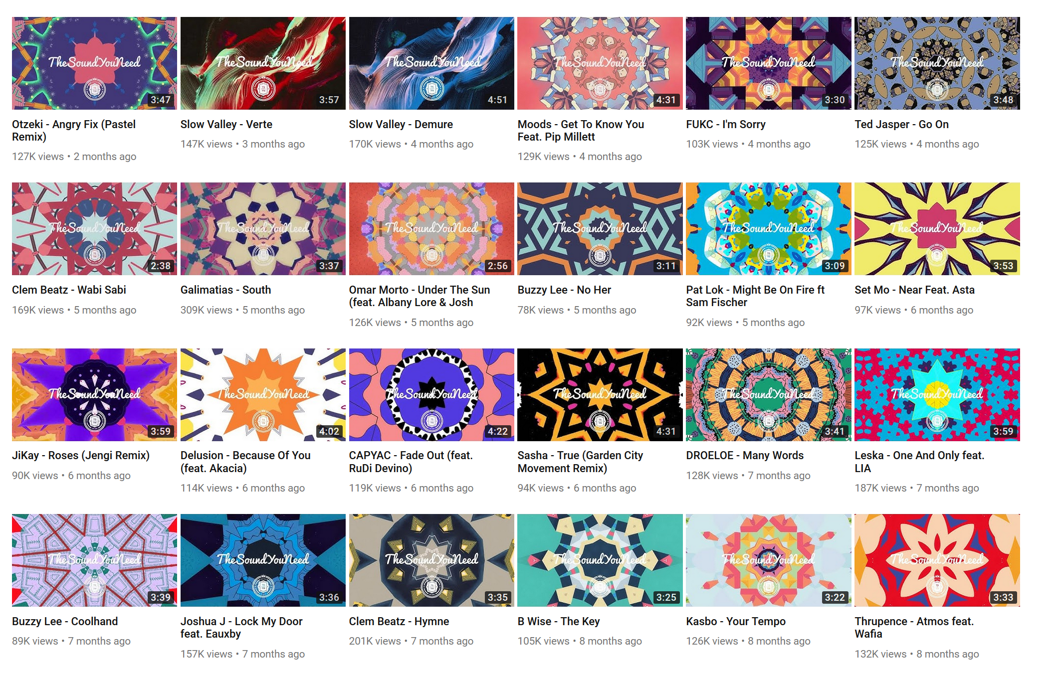
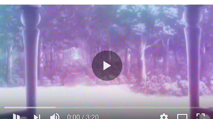
Video 1
https://www.youtube.com/watch?v=f4VmOSgTL6c
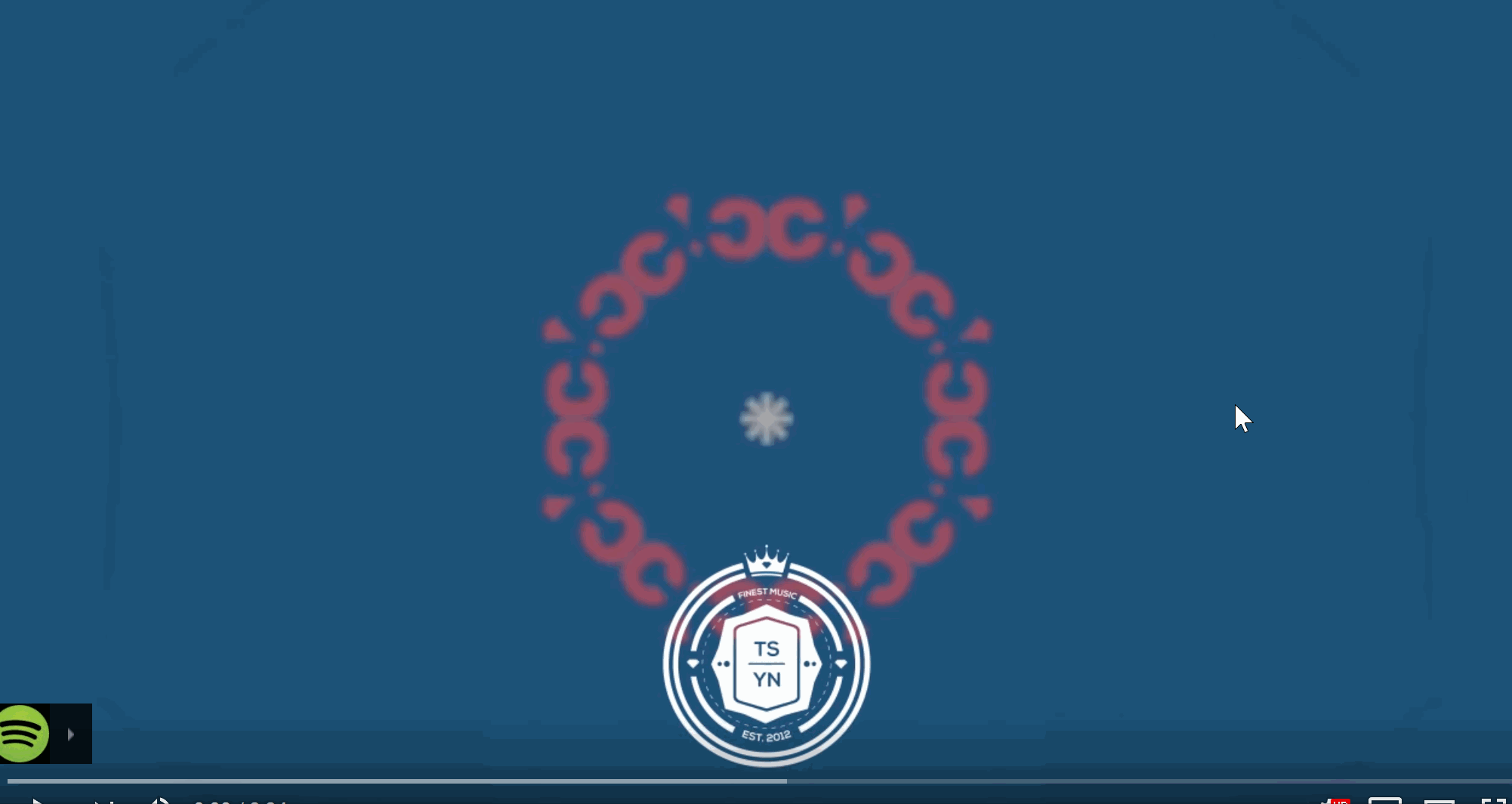
This is really involved - the channel stamp is animated out like handwriting, and the background is constantly sifting between different types of pastel colored kaleidoscope fractals.
Video 2
https://www.youtube.com/watch?v=Exg0Vmkf190
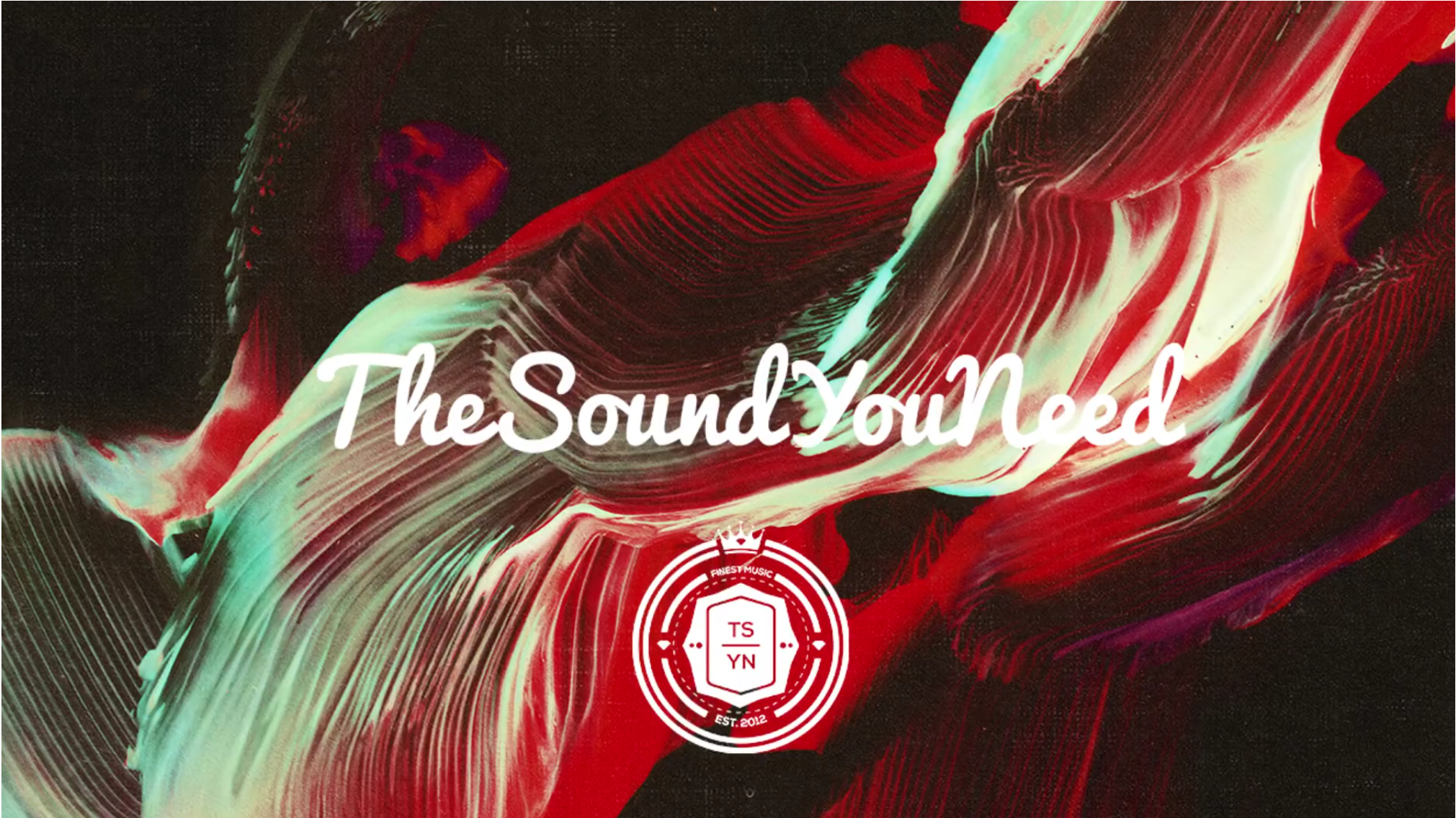
Unlike the first one, this is a classic TSYN video graphic - no animations, no fancy fractals, just some brightly abstract piece of art, stamped with their logos.
Video 3
https://www.youtube.com/watch?v=pdwVANZ5LWc
This is like a mix of the previous two styles - there’s no handwriting intro, but there are kaleidoscope fractals. Still sticking to the pastel theme here, too.
Style Summary
In terms of artistry-per-upload, I don’t think anyone on this list will match TSYN. Who among us has the patience to make fractal geometry for each video, that also seems to be beat-aligned with the music? Not me. On the other hand, they’re extremely pleasing to look at, and no doubt is responsible for a lot of captured audience attention over the years.
That handwriting into they sometimes do is also a neat effect, and although more doable than the fractals, because it can be reused, will require some thinking if we choose to go that route.
TSYN generally chooses an uplifting pastel color theme, which is nice.
As far as their logos go, I find their crest to be uninspired, but their stamp has a really nice casual feeling to it.
Video Graphic Information
TheSoundYouNeed includes their branding in each frame of the graphic.
They do not include song information.
They do not include artist information.
They do not include genre information.
About
Subscribe to TSYN and discover The finest music of our time.

✙ Bass ✙ UK House ✙ Future Garage ✙ Lounge music ✙ Hip-Hop ✙ Minimal ✙ & More..

If you want to stay even more up-to-date, you can track us on Facebook, Tumblr, Soundcloud, Twitter and Instagram

- - - - - - - - - - - -
- - - - - - - - - - - -

Contact Us

TheSoundYouNeed
Third Floor,  Bankstock Building,
42-44 De Beauvoir Crescent,
London, N1 5SB
Unites Kingdom

(Disclaimer) We do not own all of these songs. All songs found on the YouTube Channel TSYN are for promotional reasons only. Any artistic perspective portrayed in any of the songs comes from the artist of the song only. No views expressed in the songs come from TSYN, Only the artists themselves.
Website
Going by their shortened name, they own the domain tysn.co, although it contains nothing but a splash page.
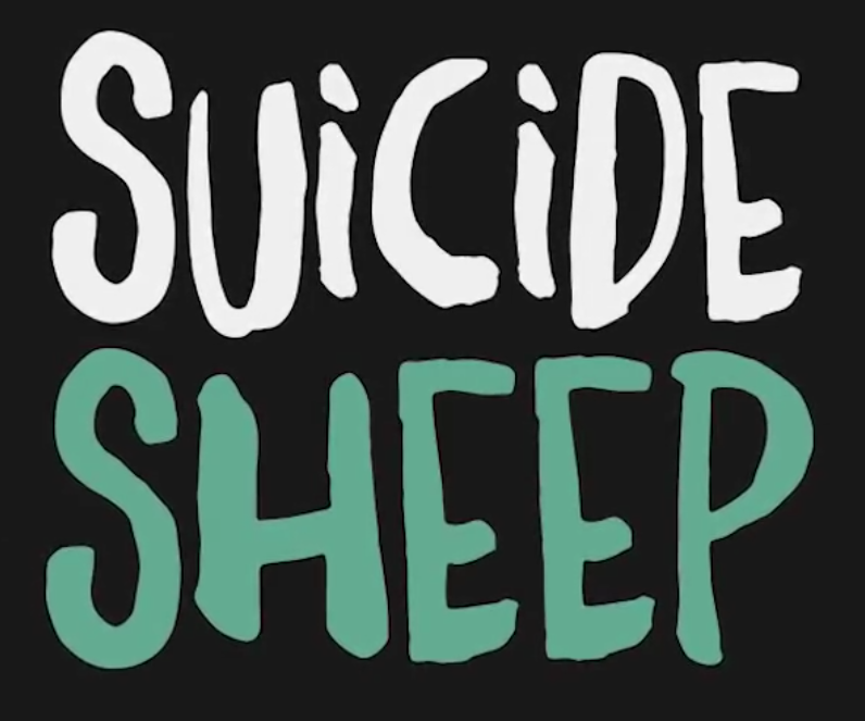
MrSuicideSheep
Name
I think once upon a time I read that the channel owner just chose the name one day during their teenage years and it became so much more than they could ever have hoped for. This would certainly explain its Invader Zim / Newgrounds-y kind of vibe.
It’s not terrible branding by any measure, though. Through longevity alone it’s become an icon of the Youtube Music field, but also it’s as unique as it gets. If we were choosing our name with the explicit intention of creating a brand from it, it’s likely not the name we would choose, but it’s also not precedent. See also, Death Row Records.
Main Graphics
crest

stamp
banner
search

Video Style
MrSuicideSheep’s House Crest is the grey-tinted sheep, and the Stamp is the black or white Suicide Sheep text. Sometimes this Stamp logo is big, and centered on the thumbnail, other times it’s small and in the corner of the picture.
What’s notable here is that although the channel is MrSuicideSheep, the curator seems to have dropped the Mr from the formal title, as everything is Stamped with just Suicide Sheep.
MrSuicideSheep does not elect to show song or artist information in the thumbnail.
Video 1
https://www.youtube.com/watch?v=pKGn7OiBU_8
Although the primary graphic is of an attractive, vaguely anime looking girl, there’s a modicum of animation with with the blurry black fade in to the channel stamp, following by a blurry fade in to an increasingly crisper still-image.
Video 2
https://www.youtube.com/watch?v=ig3YIvO0nmI
Like can be inferred from the video thumbnail list, MrSuicideSheep’s style is all over the place when it comes to the backing video graphic. This one uses some really nice art of a starry sky.
Video 3
https://www.youtube.com/watch?v=MCVi8Rxig90
Back to girls for the graphic.
This one actually has lyrics at the bottom, but due some video capture errors, I was not able to record the lyrics. But that’s one interesting way to do it, if you happen to feel like putting in extra effort and also know the lyrics to the song.
Style Summary
As far as video graphics go, MrSuicideSheep has a big variety - some are uplifting, cute girls; others are sprawling vistas; others still are drawings and paintings at varying degrees of abstraction. It almost looks like whatever the channel curator happens to be feeling at that particular moment. There is no overarching, cohesive sense of style to the graphics.
I also find the channel crest to be very strange. It is such a light shade of gray, with such a nondescript graphic in the middle, that my first impression is that of a thumbnail placeholder while some other asset loads in. Of course that is not the case and that is the full graphic.
Notably that graphic is almost not used - far more widespread if the stamp, containing the slightly loopy font spelling out their name.
Additionally, although the channel branding is relatively visible in the thumbnails, it is really hard to find in the video graphic beyond the first 5 seconds of the intro animation. If you look carefully you can see it in the bottom right corner, but the focus is clearly on the good pictures instead.
Video Graphic Information
MrSuicideSheep includes their branding in each frame of the graphic, but in a very small and unobtrusive way.
They do not include song information.
They do not include artist information.
They do not include genre information.
About
On this channel you will find a wide variety of different electronic and sometimes non-electronic music. I strive to find the best and most enjoyable music for you guys. I hope you have a good time here :)

Please submit your music here.
http://submit.mrsuicidesheep.com/
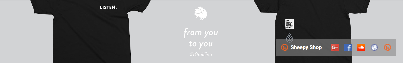
Website
https://www.mrsuicidesheep.com/ is an owned domain, but it just serves as a portal to advertise branded shirts.
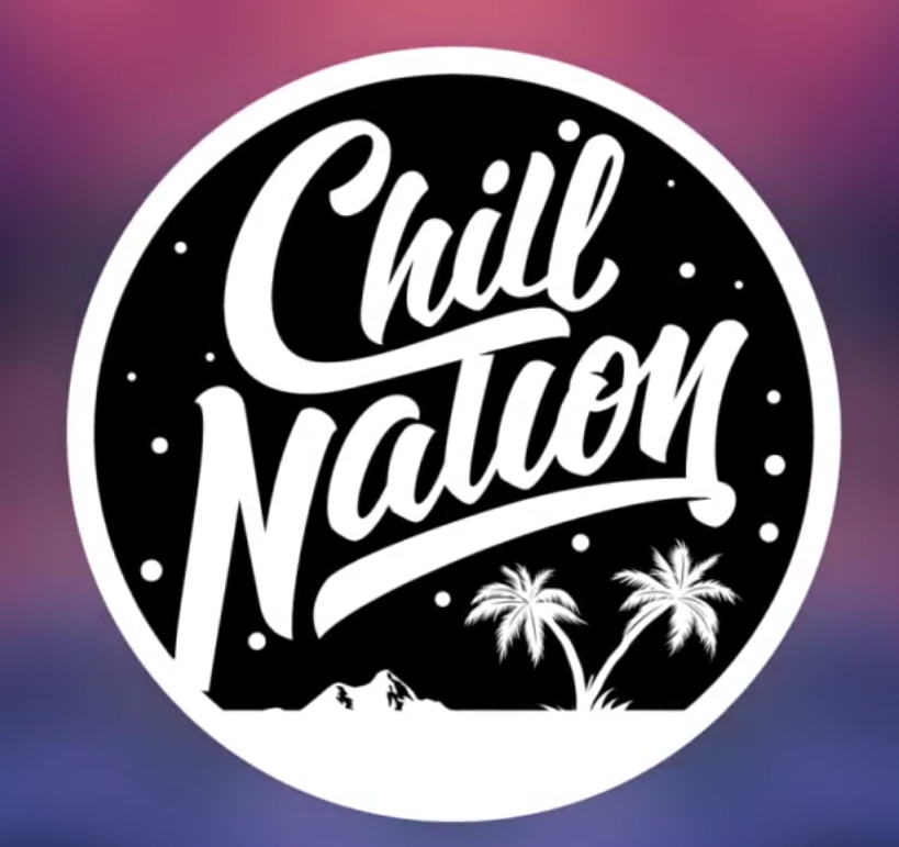
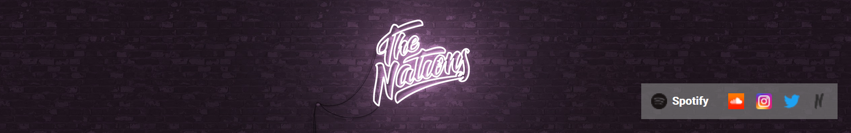
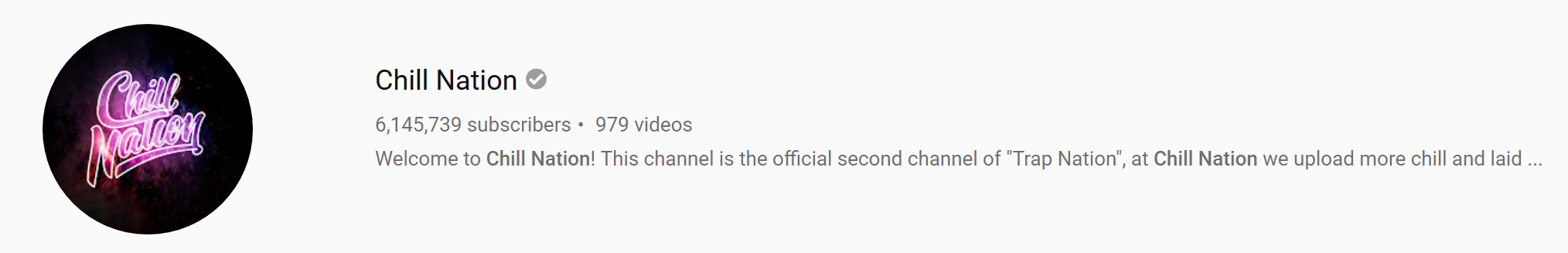
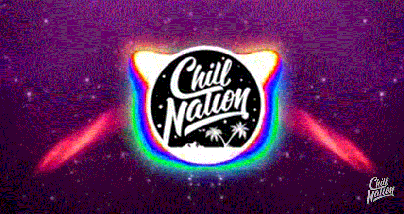
Chill Nation
Name
Like the other *Nation channels, this channel’s name evokes images of togetherness, comradery by being members of the nation. It reminds me of Red Sox Nation, which is the same thing but for fans of that baseball team.
The Chill in this particular channel represents the kind of music they post. They’ll post songs of significantly different genre to one of their many other channels.
Their final branding score? 7/10
Main Graphics
crest
stamp
banner
search
Video Style
Although Chill Nation follows the Crest / Stamp duology, the Crest half isn’t much different from the Stamp half.
Both spell out Chill Nation in the same font, the only difference is the font and background color. Additionally, the Stamp half has some palm-trees in the bottom, which is a nice touch of style.
I actually wonder why they don’t just standardize on the Stamp for all their logos, it’s much better than the Crest.
Chill Nation does not elect to show song or artist information in the thumbnail.
Video 1
https://www.youtube.com/watch?v=03GwlsRZnMY

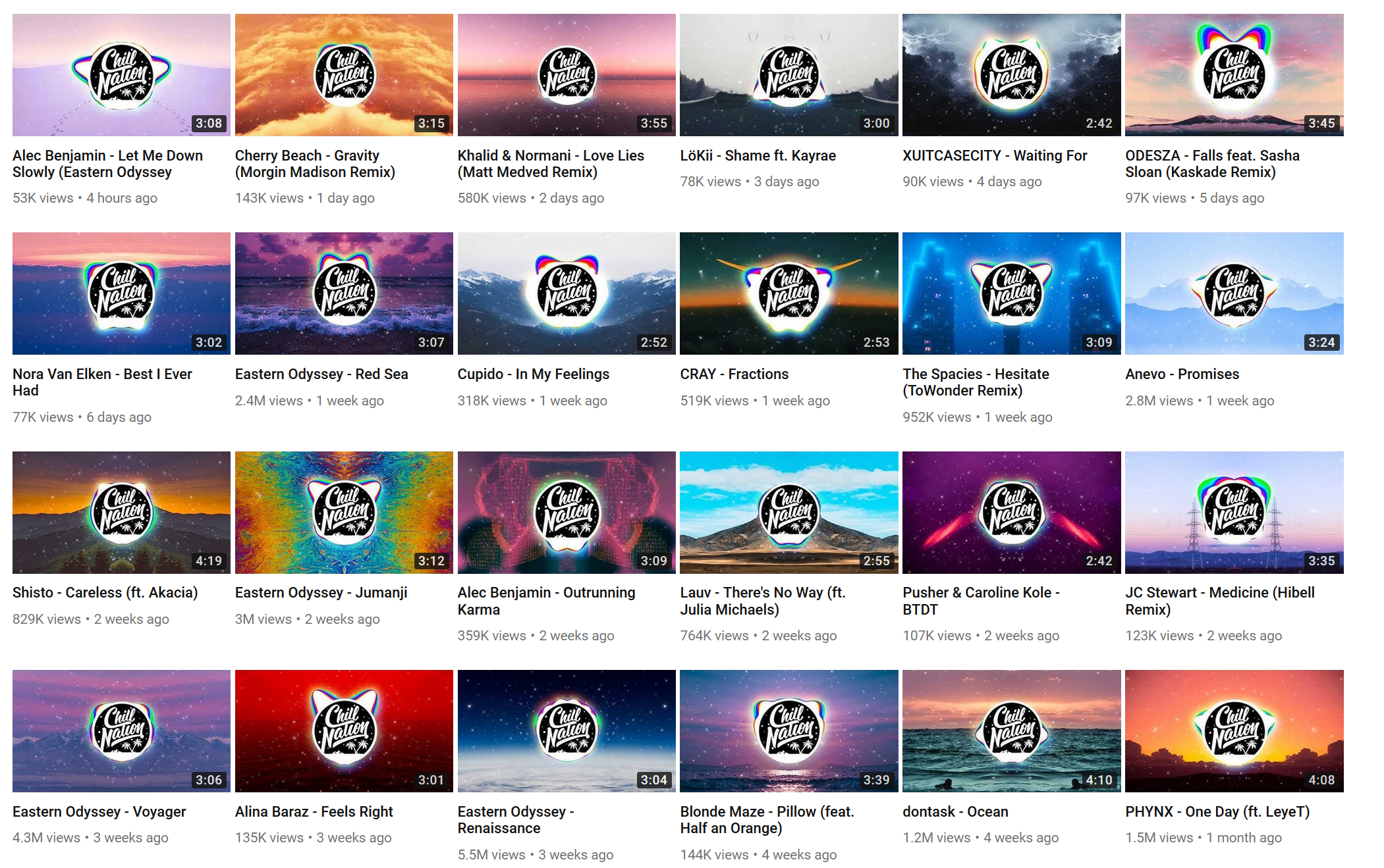
Chill Nation tends to go for either some kind of vaguely interesting but structureless colored background, or for some epic vista of nature as their background.
They have chosen the vista.
This is also our first introduction to the sheer production of the Trap Nation network – Smooth crest fly in from off screen displaying all their other channels for a second, the subtle, constant swaying motion of the palm trees inside that crest, the slight pulsing of the snowflakes to the beat of song, and once the song gets underway, in addition to all of the above, they map the waveform to a kind of oil-colored pulse on the circumference of the crest.
trap Nations love for animation is abundantly apparent, and it’s generally a pleasure to look at.
Video 2
https://www.youtube.com/watch?v=iAakgRlbJok
Like described above, this is one of their formless color choices of background.
We can see a good example of what the song beats look like when we’re deep into the music. Strong pulses and big animations everywhere.
Plus we can see their smooth “Follow on Instagram” plug that rolls in at the bottom left for a bit before rolling away.
Video 3
https://www.youtube.com/watch?v=OUBrVRcnQds
I neglected to grab a video capture for this track because by this point it’s clear that Chill Nation has no variation. This one was a nature background exactly like the first, and had no other special qualities.
Style Overview
The Trap Nation channels go big on animation, and they put in effort for each video to make it pleasant to look at with the waveform pulsing. Their background choice leaves something to be desired though, because aside form the nature vibes, each video has a really “samey” kind of feel to it. All that is different is the strength of the waveform.
These guys are great at branding though. Stamp in the bottom corner, Instagram banners poking out occasionally, the quick “did you know we had all these other channels” showcase at the beginning of each video. It’s all quite fantastic.
Video Graphic Information
Chill Nations branding is front and center, the literal focal point of each piece, plus their sister channel showcasing at the start, and just in case you forgot, their stamp is the bottom righthand corner as well.
They do not include song information.
They do not include artist information.
They do not include genre information.
About
Welcome to Chill Nation! This channel is the official second channel of "Trap Nation", at Chill Nation we upload more chill and laid back music you won't hear on Trap Nation.
Website
Chill Nation delegates their website to their parent Nations, at https://nations.io/pages/chill-nation.
These guys actually have legit websites with descriptions, proper links, and a dedicated shop.
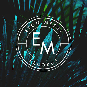
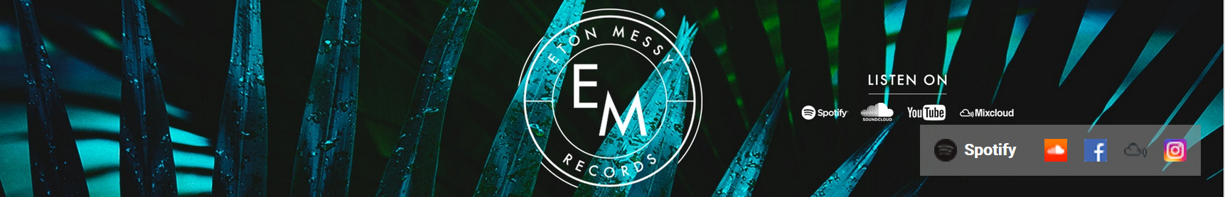
Eton Messy
Name
What’s in a name? Not necessarily anything in particular, apparently. Although it sounds like someone’s name, it is no such thing. They’ve gone for uniqueness above all else - certainly no google search will ever be confused as to what you mean when you ask it for Eton Messy, or any potentially mistyped variation thereof.
It leaves them with few obvious choices to create any kind of visual link with their name, but there’s a certain freedom that comes with that as well, in that they can make anything at all their brand.
Main Graphics
crest
banner
search
Video Style
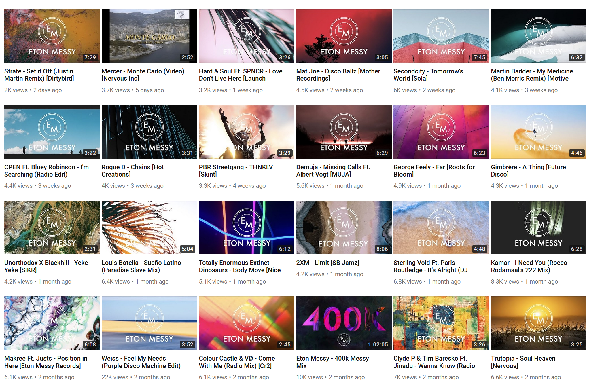
Speaking of standardizing on one logo, Eton Messy definitely standardized on the Crest, and it looks good. Their video stamps prominently include their formal name, but the real draw is the Crest.
Like every other channel, Eton Messy does not show the song or artist name in the thumbnail.
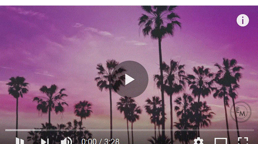
Video 1
https://www.youtube.com/watch?v=e6hQand8MjM
A pleasant looking natural background, with a smooth ripple like animation for the fade-in of the stamp, which contains no text except for the initials of the channel.
Video 2
https://www.youtube.com/watch?v=qs0biWHy5WU
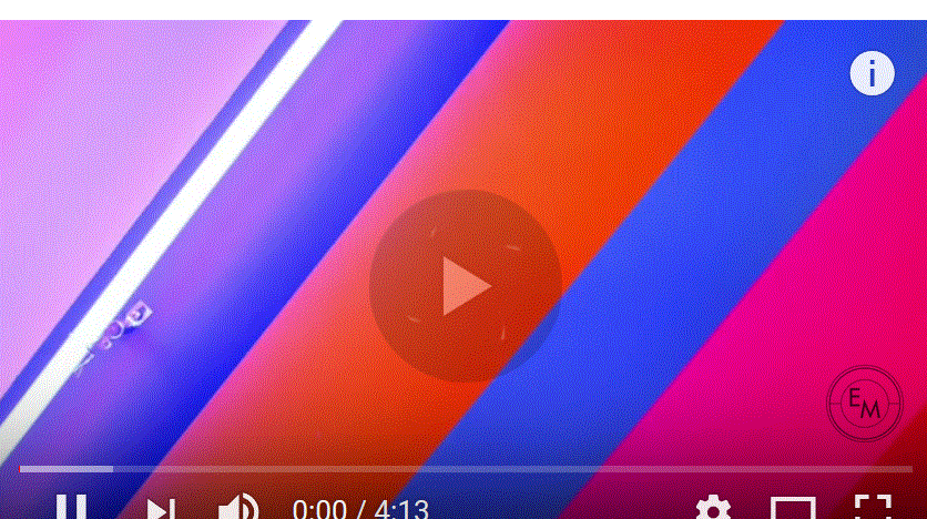
An abstract piece, pleasant to look at, with the stamp ripple fade-in.
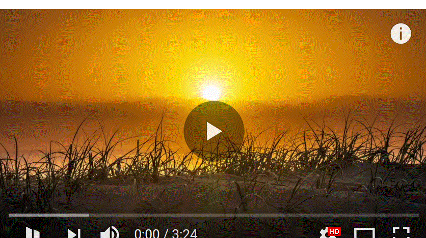
Video 3
https://www.youtube.com/watch?v=O9N-0krx57k
A pleasant looking tropical background with the stamp ripple fade in.
Style Overview
Although the animation of the logo is nice, it becomes clear that Eton Messy puts less effort into the video once the fade-in has been completed. This is fine, this puts them closer to Majestic Casual than, say, MonsterCat, and that’s perfectly okay.
They tend to go for eye-catching backgrounds, the type you’d elect to make your desktop wallpaper.
If their main logo weren’t enough to tell you who you were watching, a faded version of it can be found in the bottom righthand corner.
Graphic Overview
Eton Messy does not include any information in their video graphics, only the channel stamp.
About
Eton Messy is a Youtube channel turned Record label, which has included dance music events and an international DJ outfit, playing various genres within dance music, including disco, house, deep house, tech house, progressive and funky etc.

For DJ bookings/Event enquiries contact:
tim.levy@mn2s.com

Latest playlists ⟼ Spotify http://bit.ly/EMspotify
Latest news ⟼ Facebook http://on.fb.me/R5QGH6
Latest mixes/music ⟼ Soundcloud http://bit.ly/LMFAUi
Latest chat ⟼ Twitter http://bit.ly/PAcpsh
Latest images ⟼ Insta http://bit.ly/2vC0CRS

Track Submissions ⟼ etonmessysubmissions@gmail.com
DJ Promo list ⟼ https://goo.gl/forms/ygDJf9XUoKSLjJXw2
Business (no music please) ⟼ info@etonmessy.com

For DJ bookings/Event enquiries contact:
info@etonmessy.com

For any copyright issues please get in touch: info@etonmessy.com

Enjoy!
Website
Eton Messy are the first guys on this list to have a truly functional website, although it’s a bit busy and overly complex.
They have their latest YouTube posts in a step-through queue at the top, a list of upcoming events they’re sponsoring or are otherwise interested in, featured news, and a decent about page.
Eton Messy gets points for having a real website, but they really need to tone down the busyness.
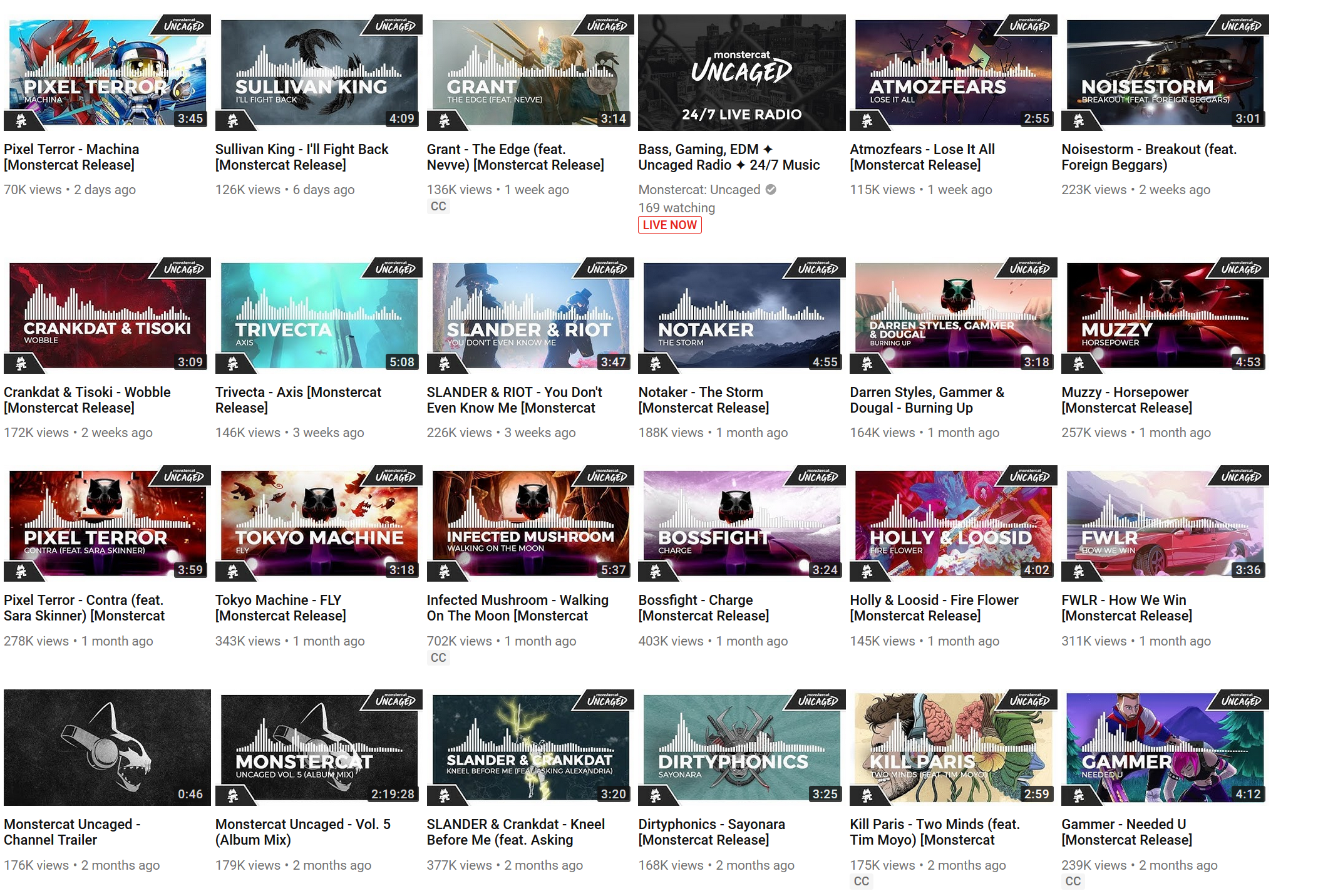
Monstercat
Name
These guys know how to have fun. Their brand is that of a goofy, cartoony, cat-thing. Some kind of monster cat.
No problems with uniqueness here. Even in obscurity, just adding “music” would have gotten the proper results, and in their immense popularity they completely dominate anything even related to the term.
Plus it opens the avenue for some fun graphics that link into the name.
Main Graphics
crest

banner
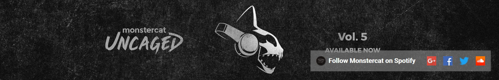
search

Video Style
And now for something completely different.
Monster Cat has a funky, distinct and silly logo. High contrast, designed by someone with some humor. You’ll never mistake this logo for any other logo, which one might reasonably do with nearly everything else on this list.
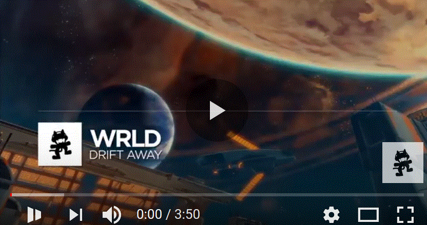
They don’t even have a regular stamp - sometimes they’ll include the album art of the album of the release they’re showcasing, but they take a real different approach to how they stamp their video thumbnails:
Song info is front and center, below a neat waveform visualization of the track in question. Below that in the left corner is a small crest icon, just enough that you’ll know what it is when you see it, but not big enough to make the channel the main focus. For Monstercat, the music is focus, not the Monstercat.
Video 1
https://www.youtube.com/watch?v=8Bcw-A92Wbs
Video 2
https://www.youtube.com/watch?v=TBiJ-RAmCB4
Video 3
https://www.youtube.com/watch?v=fxOjcjl3TFU
Style Overview
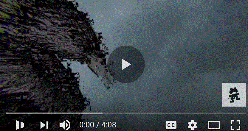
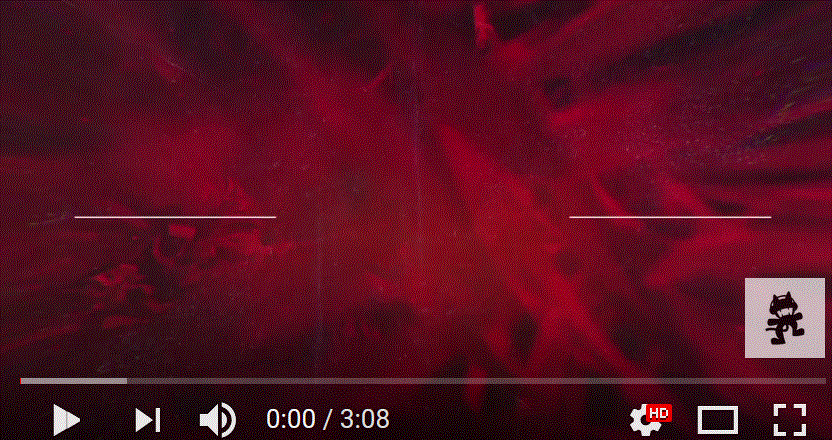
Because Monster Cat is now a major record producer, they have access to a lot of awesome album art assets, so they can do some awesome animation with the album art of the artist they are showcasing.
The background of each MonsterCat video is the album art, animated in some capacity, either lightly, like in Video 2 and 3, or heavily, like in Video 1.
The most prominent graphic is the standard audio volume meter, meaning you can pretty easily track and follow along with the song just visually.
The thing that sticks out the most is how respectful MonsterCat is of the artists:
- the Artists name is the largest piece of text on the screen
- The song name is always displayed
- In addition to the album art as background, the album art gets to replace the primary MonsterCat logo
- And the artist name gets to replace the MonsertCat logo too, it flips around a lot
This is super nice, and respectful to both listeners and artists
Graphic Overview
MonsterCat chooses to prioritize artist and song marketing over themselves
They do not display genre information in the videos, but their video descriptions all contain #hashtags of the genre, such as #dubstep, #heavyedm, etc.
About
Unbound, Unlimited, Uncaged! Monstercat breaks the barriers of expectations with a movement that will make 2018 the biggest year in our history.

Monstercat is a new-age Record Label. It is the convergence of an independent label, tech startup and media company. We empower creative people, musicians, artists, developers, entrepreneurs, and influencers young and old. We looked at the problems within the music industry, asked “why not” and have created the “how to”.

If you would like to use Monstercat's music in your own videos or Twitch streams:
https://license.monstercat.com
Website
Although their branding is goofy, Monstercat doesn’t joke around. Their website is the real deal, professional to the core. Their music is front and center, but their artists, publishing information, blog and other aspects are all available at the click of a button.
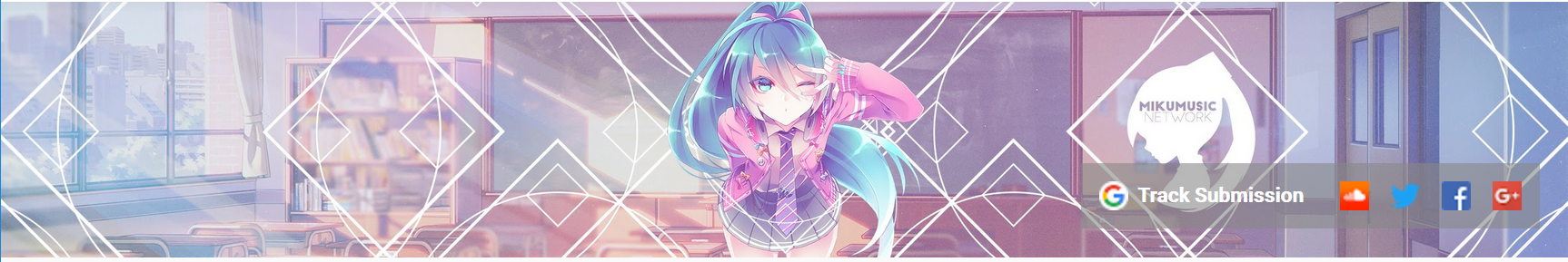
MikuMusicNetwork
Name
If their video thumbnails didn’t give them away their name sure does. These guys are weebs. Their music taste is alright though.
They don’t really live up to their name of being a music network, that’s much more like Chill Nations thing, but they get close enough.
Main Graphics
crest

stamp
banner
search

Video Style
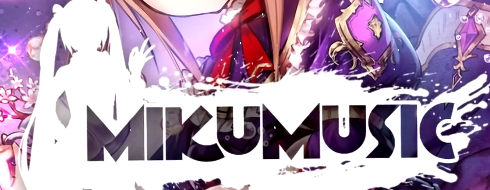
Speaking of completely different, once again here’s something different. These guys are taking a new spin to the Crest/Stamp duology. There’s a base, which is fractal diamonds, and then they switch up what’s inside. The crest has a Miku silhouette with a stylized ミク in the middle.
As for the stamps, there are actually two, The first takes the base crest and drops the middle image, leaving room for cute anime girls to pop out and be framed by the fractals.
The second stamp is a more traditional take with the name, the short form in this case, written out along with a splashy icon.
It seems to be random whether one stamp is used over the other.
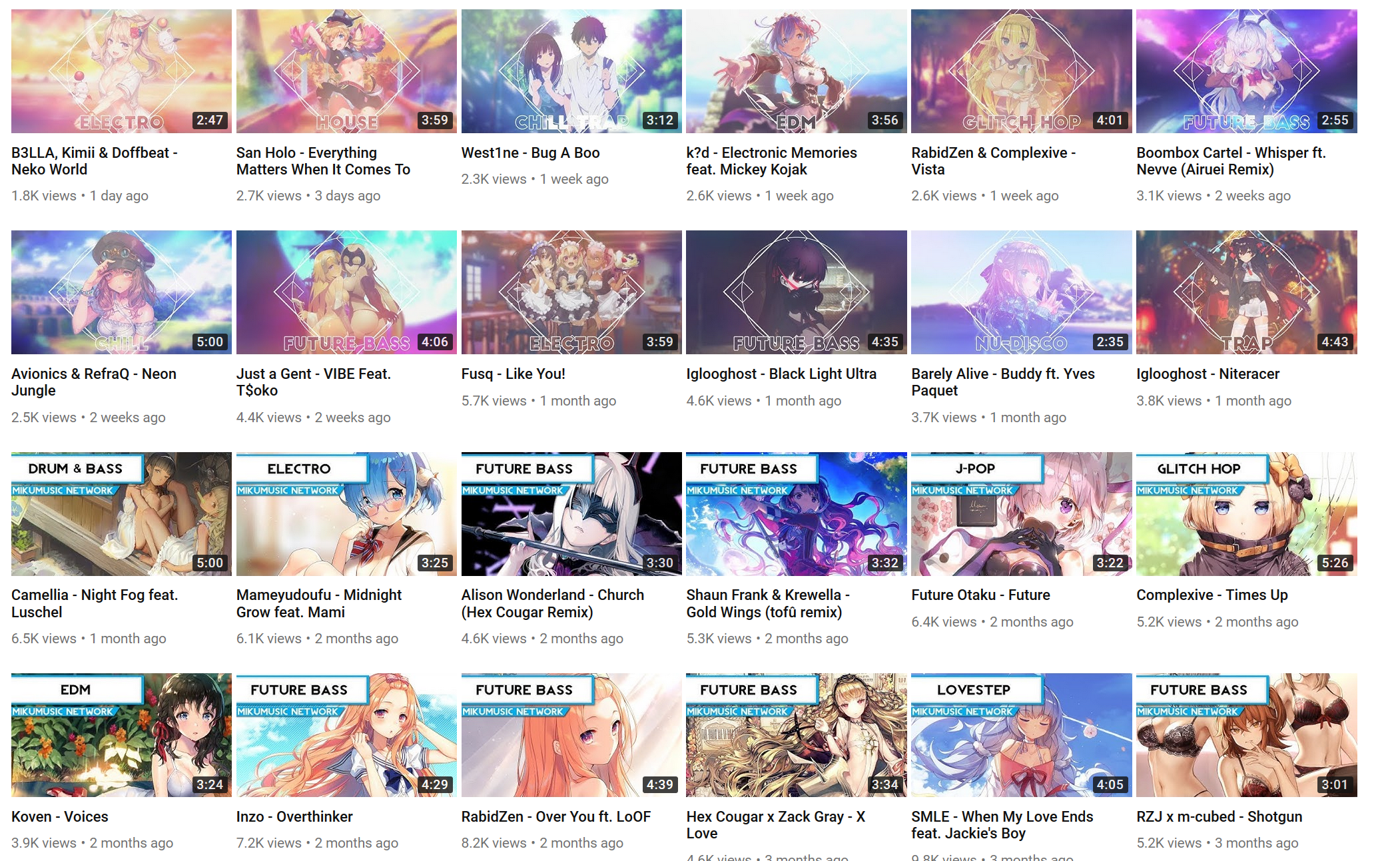
The thumbnails take another interesting twist - Instead of prioritizing either the channel name or the artist, the thumbnails prioritize the genre. Each thumbnail is, to varying degrees of clarity, tagged with Electro, Drum & Bass, Future Bass, Lovestep. That’s an interesting take on the thumbnail concept, and I quite like it.
Additionally, even without the channel name, it’s clear where the video is coming from. The concept, style, and execution of the genre tags are so unique, as well as the choice of vivid, bright color pallet anime girls makes it obvious.
Video 1
https://www.youtube.com/watch?v=oFbljhlRmIQ graphic: cute anime girl / with icon
These guys seem to have an animation budget, although they also seem to have some strange tastes. Each of their videos is a bit jumpy because there’s this constant rocking motion of the frame.
Putting the rocking aside, the graphic is actually super cool. The rotating squares around the center, and the two diamonds showing the name of the artist, and the song are really neat.
And then their choice of cute anime girl, in this case a catgirl, gets a cool stripe fade in.
Their stamp is on the bottom, after the crest gets replaced with the catgirl.
Video 2
https://www.youtube.com/watch?v=53vGcMbQAuQ

This is the second of two main styles that MMN opts for. This format opts for an entirely different set of logos for themselves, though they kept their animation budget.
Their Crest becomes the stylized Miku(ミク), and their stamp becomes this themed Hatsune Miku paint splash.
They stick to their cute anime girl aesthetic, but don’t opt for displaying any information about the song.
As usual, the rocking continues.
Video 3
https://www.youtube.com/watch?v=Ahlji3K5MuQ
The third video follows the first - rocking, a cool anime girl fade-in, and rotating diamonds.
Style Overview
When in comes to the first of their video styles, I find the MikuMusicNetwork to be just as respectful to the artist as MonsterCat is: Their priority is to showcase cute anime girls, but the artist and the song title are on prominent display.
However, style 2 is focused on the network, and doesn’t showcase anything about the song in question.
Their animation budget is evident, and appreciated, but they really need to do away with the constant rocking. It’s just weird and distracting.
Graphic Overview
MMN sometimes chooses to display artist information, and sometimes doesn’t.
Notably, the thumbnails actually contain the information all the time, with additional genre information, as available,
It would be nice if this information was there all the time.
Their logo is always present, either in the intro fade-in, or at the bottom using one of their two splash icons.
About
Welcome to MikuMusicNetwork, a Anime inspired music promotion channel that focuses on bringing smaller artists and bigger ones alike to one convenient place for you to listen to, from the hardest of drops to the chillest of vocals!

Want your track to be uploaded or do you want to label your latest release with us? That is possible! Click on Track Submissions and fill in the form. We'll respond as soon as we can!

Be aware that we get plenty of submissions and we are unable to respond to all of them! We are working currently on a better method that allows us to respond to all submissions!

Music Producer or Label? Have an issue regarding a video hosted on this channel? Please contact us through PM and we will respond as quick as possible!
Website
There is no website associated with this channel.